Chapter 13
Forms and Controls
While some VFP applications do most of their work behind the scenes, forms are still the principal way for an application to communicate with users. VFP 9 offers a variety of ways to make forms more attractive and easier to use.
The bottom line in writing applications is providing some functionality. While some applications do that invisibly, most include at least some interaction with users. To those users, the application’s interface is the application. So anything that helps you provide an easier to use, more attractive user interface makes the people you write code for happier.
VFP 9 includes many changes aimed at the user interface. They range from significant new capabilities to minor tweaks. In this chapter, the changes are organized based on what piece of the interface they impact.
Controlling forms
Two major changes in VFP 9 affect forms as whole. First, VFP forms can now be docked. Second, a new property of controls makes it much easier to cope when a form is resized.
Docking user forms
VFP 7 introduced docking to the product, making a number of the IDE windows dockable, including the Command Window, the Property Sheet, and the View window. VFP 8 improved docking of those windows, providing programmatic control over docking and making docking persistent between sessions.
VFP 9 ups the ante significantly, making user-defined forms
dockable. This change means you can put dockable forms into your applications,
and all the developer tools
written in VFP code (like the Class Browser, the Toolbox, and so on) can be
docked.
(Only the Toolbox is configured as dockable out of the box, but you can modify
the
others to be dockable.)
Forms have three new properties and two new methods to
support docking. The properties are shown in Table 1. The methods are Dock, which docks and undocks the
form, and GetDockState, which lets you check on the status of a form.
Table 1. Forms have three new properties to support docking; two of them are the same properties as for toolbars.
|
Property |
Meaning |
|
DockPosition |
Indicates the current docking status of the form. Read-only. |
|
Dockable |
Specifies whether the form can be docked. |
|
Docked |
Indicates whether the form is currently docked. Read-only. |
In order to dock a form, it must support docking, as specified by the Dockable property. The property takes three values, shown in Table 2. You can change the property at run-time, for example, to let users decide whether or not a particular form is docked.
Table 2. A form can support docking or not. If it supports docking, at any given time, it’s either dockable or not.
|
Dockable setting |
Meaning |
|
0 |
The form cannot be docked (does not support docking). |
|
1 |
The form supports docking and is dockable now. |
|
2 |
The form supports docking, but is not dockable now. |
As with IDE windows, when a form is dockable (Dockable is set to 1 or 2), its context menu includes a Dockable item. When that item is checked, Dockable is set to 1; when it’s unchecked, Dockable is set to 2.
Turning on docking support for a form (that is, setting
Dockable to 1 or 2) affects quite
a few other properties. The complete list is included in the Help topic for the
Dockable property. Most immediately apparent is that HalfHeightCaption is set
to .T., which changes the appearance of the title bar. Figure 1 shows the impact of Dockable on the title
bar. Setting Dockable to 1 or 2 in the Property Sheet makes the form visible
before code in the Init method executes, instead of waiting for the Show
method. If you have code to manipulate the form
in the Init method, you may want to set Dockable in the Show method instead of
in the Property Sheet. In addition, when a form supports docking, the settings
of MaxHeight, MaxWidth, MinHeight, and MinWidth are ignored and BorderStyle is
set to 3-Sizable;
this means the user has free reign over the size and shape of your form, so
make sure it behaves appropriately.
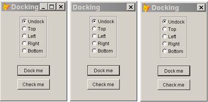
Figure 1. The setting of Dockable affects many properties and determines the appearance of the title bar. The three forms here have Dockable set to 0, 1, and 2, from left to right.
Once a form supports docking and has docking turned on (Dockable=1), you can dock it interactively or programmatically.
Interactive docking of user forms works like docking of IDE forms—just drag the form to the border where you want to dock it. User forms can be docked with other user forms as well. Again, you use the same approach as with IDE forms. To tab dock two forms, drag the title bar of one onto the title bar of the other. To link dock two forms, drag one over the other until the outline of the dragged form changes to indicate docking. Interactive undocking of user forms is the same as for IDE windows, as well. In all cases except tab docking, drag the title of the form you want to undock. For tab docked forms, drag the tab of the form you want to undock. Of course, unchecking Dockable in the context menu of the form’s title bar immediately undocks the form. Use the Dock method to dock forms programmatically. A new parameter has been added to this method to support docking one form with another. The new syntax is:
Form.Dock( nPosition [, oForm ] )
The values for
nPosition are shown in Table 3. oForm is an object reference to another form.
When you include an oForm parameter, the two forms are either tab-docked or
link-docked, depending on the value of nPosition.
Table 3. The nPosition parameter of the Dock
method determines how the form
is docked.
|
nPosition |
Meaning |
|
-1 |
Undock the form |
|
0 |
Dock the form at the
top. |
|
1 |
Dock the form at the
left. |
|
2 |
Dock the form at the
right. |
|
3 |
Dock the form at the
bottom. |
|
4 |
Tab dock the
form with the specified form. |
Interactively, you can dock
user forms with any dockable windows, whether they are VFP forms, VFP tools
written in VFP (like the Toolbox or Class Browser), or IDE windows (like the
Command Window). Programmatically, though, you can dock user forms only with
other VFP forms, including
those for tools written in VFP. You can’t dock user forms with built-in
windows programmatically.
Of course, once you can
dock windows, you need a way to check whether they’re docked and, if so, to
what. The new GetDockState method fills an array with information about the
docking state of the form.
GetDockState accepts a
single parameter: the name of an existing array. If the form is dockable
(Dockable = 1), the array is sized appropriately and filled with data; in that
case, the method returns .T. If the form is not dockable (Dockable = 0 or 2), the
array is unchanged and the method returns .F.
The parameter to
GetDockState is unusual. You have to either pass the name of the array as a
string, or pass the array by reference.
The array GetDockState
creates has six columns. Table 4 shows the columns and their meanings. Although
GetDockState is closely related to the ADockState() function, it never returns
more than one row.
Table 4. The GetDockState method tells you about the docking status of a dockable form. It populates an array with these columns.
|
Column |
Contents |
|
1 |
Caption of the form that called the method. (Note that Help says this is the name of the form.) |
|
2 |
1 if the form is docked. 2 if the form is not docked. |
|
3 |
Docking position, using the values shown in Table 3. |
|
4 |
Caption of the form or window to which the form is docked. |
|
5 |
Object reference to the form that called the method, |
|
6 |
Object reference to the form to which the calling form is docked. If the form is docked to an IDE window, the empty string. |
GetDockState shares a confusing behavior with ADockState(). When forms or windows are tab-docked or link-docked, the first form or window in the group (the leftmost or top) shows as docked (column 2 = 1), but has –1 in the third column and columns 4 and 6 contain the empty string.
Anchoring controls
Ever since FoxPro
gained resizable windows, developers have been struggling with the question of
how to handle form content when a window is resized. Should controls be
resized? moved? left alone? How do we know what the user was trying to do by
resizing
the window?
Over the years, many
solutions have been proposed. What they all have in common (except for those
recommending you don’t let users resize forms) is that they involve a lot of
code, often requiring code for every control as well as the form itself. (You
can find one solution in the FoxPro Foundation classes, as _resizable in the
_controls.vcx class library.)
VFP 9 makes all that
code obsolete by adding the Anchor property to all visible controls. Anchor lets
you specify what happens to a control when the control’s container is resized.
The control can move, change size, or both, and the horizontal and vertical
directions are controlled independently.
When a user resizes a
form, you may not want all the controls to do the same thing. For example, if a
form gets both wider and taller, a textbox should probably get wider, but an
editbox should get larger in both directions. Any controls under such an
editbox need to move down, but controls above the editbox may want to stay
where they are. The Anchor property lets you consider all the possibilities and
set up your forms to behave in the way you think users will find most natural.
Anchor is an additive
property; you choose the values you want and add them together to form a single
value. Because the number of possibilities is large enough to make specifying
this value difficult, VFP 9 includes a tool (discussed in “The Anchor Editor”
later in this chapter) to help you.
Anchoring takes place
with respect to the four borders of the control’s container. For each, there
are three options:
·
the
control is anchored absolutely to that border, meaning the distance between the
specified edge of the control and that border remains constant;
·
the
control is anchored relatively to that border, meaning the distance between the
specified edge of the control and that border is changed to maintain the ratio
of that distance to the form’s size in that direction;
·
the
control is not anchored to that border, meaning a change to that border doesn’t
affect the size and position of the control.
Rather than anchoring
to each border, you can specify that the center of the control is anchored
relative to the borders, either horizontally or vertically, but the control
itself doesn’t change size. This is a good choice for controls that should move
in order to remain in a particular part of a form, such as buttons that should
always be in the lower right corner.
Table 5 shows the values you can add together for Anchor. Note that some of these values are mutually incompatible. The Help topic for Anchor lists the incompatibilities.
Table 5. To specify the Anchor property, add the values you want together.
|
Value |
Name |
Meaning |
|
0 |
Top Left |
Anchors the control to the top and left borders of its container, keeping the distance constant. This is the old, default behavior of controls. |
|
1 |
Top Absolute |
Anchors the control to the top border of its container, keeping the distance constant. |
|
2 |
Left Absolute |
Anchors the control to the left border of its container, keeping the distance constant. |
|
4 |
Bottom Absolute |
Anchors the control to the bottom border of its container, keeping the distance constant. |
|
8 |
Right Absolute |
Anchors the control to the right border of its container, keeping the distance constant. |
|
16 |
Top Relative |
Anchors the control to the top border of its container, keeping the distance relative to the original distance. |
|
32 |
Left Relative |
Anchors the control to the left border of its container, keeping the distance relative to the original distance. |
|
64 |
Bottom Relative |
Anchors the control to the bottom border of its container, keeping the distance relative to the original distance. |
|
128 |
Right Relative |
Anchors the control to the right border of its container, keeping the distance relative to the original distance. |
|
256 |
Horizontal Fixed Size |
Anchors the center of the control to the left and right borders of its container, keeping the control’s width constant. |
|
512 |
Vertical Fixed Size |
Anchors the center of the control to the top and bottom borders of its container, keeping the control’s height constant. |
Consider the form shown in Figure 2. The original form is shown on the left and the resized form on the right. When this form is resized, the size of the labels remains unchanged, the textboxes change size horizontally only, the editbox changes both horizontally and vertically, and the buttons remain centered horizontally. All the controls below the editbox move appropriately as the editbox changes size. Table 6 shows the settings used for the controls in this form.
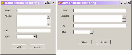
Figure 2. When a form is resized, the behavior of controls depends on the type of control and the control’s position on the form. With Anchor, you can specify the behavior of each control separately.
Table 6. The form in Figure 2 demonstrates a
number of useful combinations
for Anchor.
|
Control |
Anchor |
Meaning |
|
lblName (Name label) lblAddress (Address label) |
0 |
Anchor absolutely to top left corner. Don't move or resize. |
|
txtName (Name textbox) |
10 |
Anchor absolutely to left and right sides, so resize horizontally. |
|
edtAddress (Address editbox) |
15 |
Anchor absolutely to all four borders. Resize both horizontally and vertically. |
|
lblCity (City label) lblState (State label) cboState (State combobox) |
4 |
Anchor absolutely to bottom border. Move vertically. |
|
txtCity (City textbox) |
14 |
Anchor absolutely to left, right, and bottom borders. Resize horizontally and move vertically. |
|
cmdSave (Save button) |
132 |
Anchor absolutely to bottom border and relatively to right border. Move horizontally to keep relative to original position. Move vertically. |
|
cmdCancel (Cancel button) |
36 |
Anchor absolutely to bottom border and relatively to left border. Move horizontally to keep relative to original position. Move vertically. |
The form in Figure 2 is included in the Developer Downloads for this chapter, available from www.hentzenwerke.com, as Anchoring.SCX. The Downloads also include States.DBF, which is used by the form.
VFP’s anchoring computations are based on the position of the control at the time the Anchor property is set. (No doubt what’s going on internally is that when Anchor is set, the Left, Top, Height, and Width properties for the control are stored somewhere.) Subsequent changes in code to the control’s position or size are ignored when resizing and repositioning due to resizing of the control’s container. To reset the base position for a control, set its Anchor property to 0, and then reset it to the desired value.
You may have noticed that setting Anchor to 3 seems to offer the same behavior as leaving the default Anchor value of 0. The difference is that with Anchor set to 3, subsequent changes to the control’s position or size are ignored when resizing, but with Anchor set to 0 they are not.
The Developer Downloads for this chapter, available from www.hentzenwerke.com, include
Anchor0vs3.SCX, a form that demonstrates the difference between Anchor=0 and Anchor=3.
Click the
Right or Down button on the form, and then resize the form. Watch the button
marked 3 jump back to its original position, while the button marked
0 stays put.
The Anchor Editor
Figuring out the right value for Anchor for each control on a form could get tedious fast. To make it simpler, the VFP team included a property editor (see Chapter 2, “Controlling the Properties Window”) for Anchor. This tool, called the Anchor Editor, lets you set Anchor visually; it’s shown in Figure 3. To use the Anchor Editor, click the Anchor property in the Property Sheet, and then click the ellipsis (…) button next to the textbox where you type values, as shown in Figure 4.
The Anchor Editor offers three ways to specify the setting you want. The diagram on the left lets you click or use the keyboard to set each of the four directions. Click between the parallel lines (called the “anchor bars”) or type the specified letter to toggle the setting for that border among no anchoring, absolute anchoring, and relative anchoring. As the setting changes, the diagram does as well. Black indicates relative anchoring, gray indicates absolute anchoring, and no color (the background color) indicates no anchoring.
The two checkboxes let you choose the two fixed size settings (512 and 256, respectively).
The dropdown list offers common combinations; the list of
choices changes based on
the control’s base class. For example, for a textbox, it includes “Resize
width,” “Move horizontally,” and “Move vertically,” but for an editbox, the
list includes “Resize height
and width,” “Resize width,” and “Resize height.” The list always includes “No
anchoring”
as a choice.
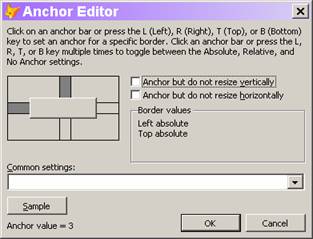
Figure 3. The Anchor Editor lets you specify the Anchor property visually. It offers several ways to specify the desired setting.
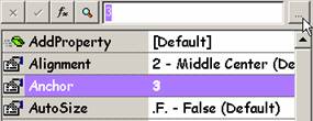
Figure 4. To use the Anchor Editor, click the ellipsis button when the Anchor property is selected.
In addition to shading the anchor bars, the Anchor Editor shows the current settings in two ways. The Border values box lists the current settings for each border for which anchoring is set. Also, the current numeric value is shown as the bottom left of the dialog.
The Anchor Editor also lets you examine the consequences of your current choices. Click the Sample button and a test form (titled “Anchor test form”) opens. It contains a control of the appropriate type (even using the Caption of your control) with its Anchor property set as currently specified in the Anchor Editor. Resize the form to see how the control behaves. The sample form is modal, so you have to close it to make changes.
When you close the Anchor Editor by clicking OK, the calculated value is saved to the Anchor property.
The Anchor Editor can work with multiple objects at once. If you select multiple controls, choose the Anchor property, and click the ellipsis button, the anchor settings you choose are applied to all of the selected controls. Be aware that when working with multiple controls, even several controls of the same base class, the dropdown for common settings is disabled.
Maximum form size
In VFP 8 and earlier, the Height and Width of a form were restricted to twice the screen resolution. VFP 9 raises the limit to 32,735 pixels for Height and 32,759 pixels for Width. We’re not sure why anyone would want to create a form that big, but you no longer have to worry about the screen resolution in creating large forms.
Displaying graphical elements
While FoxPro has included graphical elements (shapes, lines) since VFP 3, their use has been fairly restricted. VFP 9 introduces a number of changes that give you more control over the graphical elements on a form, including rotation of labels, the ability to create and rotate complex shapes, better handling of separators in toolbars, and the ability for labels to take on theme characteristics.
Rotating labels
Labels in VFP 9 have a new Rotation property that lets you change their position. Rotation accepts an integer value between 0 and 360. (If you specify decimals, they’re truncated.) Rotation takes place counter-clockwise. Figure 5 shows a label rotated 45 degrees.
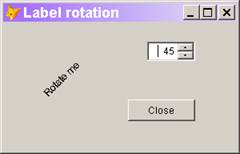
Figure 5. Rotate labels by specifying the new Rotation property. Note that rotating a label doesn’t change the orientation of its Caption.
There are several caveats when rotating labels. First, be
aware that the text rotates as a whole. Rotation doesn’t provide a way to
create vertical text with one letter under the next,
for instance.
Second, you need to make the label large enough to contain the rotated text. In the form shown in Figure 5, the Height and Width of the label are both 100 pixels. (Think of the Height and Width properties as creating a “bounding box” for the label.”)
Third, a number of properties are applied only when Rotation is 0. They include AutoSize, Alignment, and WordWrap. (See the Help for the Rotation property for the complete list.)
You might expect Rotation=0 to give the same results as Rotation=360. However, when Rotation is greater than 0, the caption is centered in its bounding box, and then rotated. With Rotation=0, the caption obeys the Alignment setting, which doesn’t offer vertical position. As a result, the caption appears at the top of the bounding box.
The form shown in Figure 5 is included as Rotation.SCX in the Developer Downloads for this chapter, available at www.hentzenwerke.com.
Creating and rotating complex shapes
VFP has always included Line and Shape controls. However, the shapes you can create with these controls has been limited. Not surprisingly, the Line control has been limited to straight lines, with the LineSlant property determining their orientation (NW-SE or SW-NE). Shapes have offered a few more options. Depending on the setting of the Curvature property, you could have anything from a rectangle or square to an ellipse or circle, including a full range of rounded rectangles. But if you wanted any other kind of shape, you had to build it yourself using multiple Line or Shape controls; specifying colors or fill patterns for the result was difficult, if possible at all.
VFP 9 changes that. You can now create any shape, providing you know how to specify its vertices. Both Line and Shape include a new PolyPoints property you can use to specify an array of points that determine the line or shape displayed.
The array must be in scope when you run the form. The easiest
way to ensure that
is to use a property of the form or control. Specify the name of the array as
the value
for PolyPoints.
If the array is in scope and contains data at design-time, the actual shape or line is shown in the Form or Class Designer. Unfortunately, this is never the case when you use a form or control property for the array. In that case, you see the boundaries for the shape.
PolyPoints can handle both one-dimensional and
two-dimensional arrays. It simply
looks at the elements in order, treating all the odd-numbered elements as
x-coordinates
and all the even-numbered elements as y-coordinates. That said, it’s easiest if
you use a
two-column array. Then the first column provides the x-coordinates and the
second column gives y-coordinates.
The values you specify in PolyPoints are percentages of the space occupied by the bounding box of the Line or Shape. To have the vertices appear, the values should range from 0 to 100. Unlike the usual Cartesian coordinate system, however, the point (0,0) specifies the upper left corner and the point (100,100) indicates the lower right corner of the bounding box. You can actually specify points outside the box; when you do so, lines within the bounding box appear, but the object is clipped by the bounding box.
Keep in mind that using percentages means the actual rendering of the shape or line changes when the Height or Width properties of the Shape or Line change.
We think the easiest way to take advantage of these new capabilities is to subclass the Line and Shape base classes (or your first level subclasses of them) and add the necessary array property. Set PolyPoints to point to that array property. Then, create all your complex shapes and lines by subclassing or instantiating these subclasses. We also recommend adding a SetPoints method called from the Init method to handle population of the array.
The Developer Downloads for this chapter, available from www.hentzenwerke.com, include Shapes.VCX, a class library containing Line and Shape subclasses that use the new capabilities. The library includes abstract Line and Shape classes with the necessary properties and method, and concrete subclasses of those classes.
Figure 6 shows a form containing two Shape subclasses (the star and hexagon) and two Line subclasses (the W and teeth), as well as a label positioned over one of the shapes. The Resize button changes the height or width of each shape or line (the change is different for each—see the code for the details) to demonstrate the effect of Height and Width on the resulting shapes. Figure 7 shows the form after clicking the Resize button twice. (Note that the Wow! label contains code that keeps it centered over the star.)
You can change the points for a polygon or polyline even after the object has been displayed. For your changes to take effect, however, you have to call the object’s Refresh method.
Polylines offer an alternative to connecting all the points with straight lines. If you specify “S” or “s” for the LineSlant property (which until now has been limited to “\” and “/”), a Bezier curve is drawn instead. (A complete explanation of Bezier curves is beyond the scope of this book. Briefly, a Bezier curve is one method of approximately fitting a curve to a set of data points.) To use a Bezier curve, the number of points specified must be one more than a multiple of 3; the number of curves drawn is the multiplier of 3 used. That is, to have one curve, specify four points; for two curves, specify seven points; for three curves, ten, and so forth. If the number of points specified is not 3N+1 (for some positive value of N), the polyline doesn’t show up at all.
The right-hand polyline (the “teeth”) in the form in Figure 6 and Figure 7 has 10 points specified. The checkbox beneath it toggles the LineSlant property between “\” and “S”. Figure 8 shows the form after checking the Bezier checkbox.
Lines and shapes with an array specified for PolyPoints can be rotated using the new Rotation property. Figure 9 shows the form with all the lines and shapes (and the label) rotated 45 degrees.
The Rotation property is ignored for lines and shapes where
PolyPoints is
not specified. If you want to rotate ordinary lines and shapes, you need to
use PolyPoints and specify the vertices.
The form in Figures 6, 7, 8, and 9 is included as UseShapes.SCX
in
the Developer Downloads for this chapter, available from www.hentzenwerke.com.
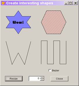
Figure 6. The new PolyPoints property lets you create polygons and polylines using the Shape and Line classes.
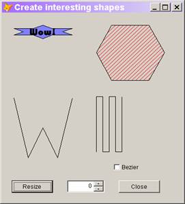
Figure 7. The actual appearance of polygons and polylines depends on both the points specified and the Height and Width of the Shape or Line control.
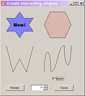
Figure 8. Specifying “S” for LineSlant causes
a polyline to be displayed using
Bezier curves.
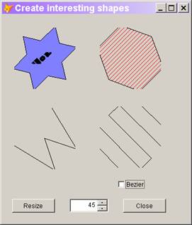
Figure 9. Rotate Polygons and polylines by changing the Rotation property. The “missing” sections of the polygons are caused by the shapes being clipped by their bounding boxes.
Managing toolbar separators
The Separator object is one of the simplest in VFP. Separators can appear only on toolbars and serve to divide the controls on toolbars into groups. VFP 9 gives you a little more control over separators.
Normally, a separator is just a space between controls. But when the Style property of a separator is set to 1, the separator displays as a line (as it does in VFP’s own toolbars). Prior to VFP 9, however, if the toolbar was undocked and arranged so the separator should be a horizontal line, no line displayed. In VFP 9, regardless of the docking status of the toolbar and its orientation, a separator with Style=1 displays a line.
VFP 9 also adds the ability to turn separators on and off by adding the Visible property to the Separator class. In earlier versions, once you placed a separator between two controls, the space or line appeared unless you actually removed the separator from the toolbar. In VFP 9, you can set Visible to False to hide the separator and pull the controls together on either side.
Combining labels and themes
Windows XP’s theme support added many complications to display issues in VFP; many of them were dealt with in VFP 8. VFP 9 offers a solution to one remaining problem.
When you put a label on a container object with gradient color (like a page of a pageframe), you normally want the gradient coloring to show behind the text of the label. You can make that happen by setting BackStyle to transparent. However, there are some situations where you really need an opaque label, but want it to use the same gradient background as its container. For example, if you have a shape on a page and you’re using a label over the border of the shape (such as to label a group of controls), you usually want BackStyle to be opaque so the border of the shape doesn’t show through the label.
VFP 8 offers two settings for the Style of a label: 0-Normal and 3-Themed. Neither of those settings handles the case described above well. With Style=0-Normal, the label uses a solid background rather than the gradient coloring of its container. Style=3-Themed uses gradient coloring, but changes the ForeColor of the label. To resolve this problem, VFP 9 offers a new Style setting for labels: 4-Themed Background Only. With this setting, the label uses the theme’s gradient coloring in the background, but leaves the ForeColor of the label as you set it. Figure 10 shows a form with three rectangles on a page of a pageframe. Each has a label overlaying the top border; each label shows one of the settings for Style.
The form in Figure 10 is included in the Developer Downloads for this chapter, available from www.hentzenwerke.com, as ThemedLabels.SCX.
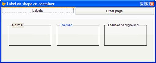
Figure 10. The new setting for Style in labels lets you use labels over transparent containers and have the background look right.
Dealing with pictures
Graphical images can serve a variety of purposes on forms. Each version of VFP has provided additional capabilities for using images, either by expanding the list of formats accepted or by offering more control over their display. VFP 9 continues this practice, with improvements in all the controls that can display pictures and text at the same time, as well as a new way to specify pictures for an Image control.
Controlling pictures and captions
VFP 8 added the PicturePosition property, allowing you to specify the relative position of an image and a text caption on command buttons, option buttons, and checkboxes. VFP 9 increases your control over the relationship between pictures and captions on these controls in several ways.
PicturePosition has a new value, 14, to indicate the Picture should be displayed and the Caption hidden. This is useful if you want to have a button or checkbox with only a picture, but also provide a hotkey. You can specify a caption with an appropriate hotkey, but set PicturePosition to 14 to hide the caption. (Of course, this means there’s no visual cue to the user for the hotkey.) For checkboxes and option buttons, a PicturePosition setting of 14 is relevant only when the Style property is set to 1-Graphical.
Once PicturePosition gave us control over the relationship
between the picture and the text, VFP developers noticed that wasn’t enough. We
wanted more control over the placement of the items in the control. The new
PictureMargin and PictureSpacing properties address
this issue.
PictureMargin specifies the number of pixels between the image and the border of the control. It’s measured from the edge specified by the PicturePosition property. For example, if PicturePosition is 10 (image centered below the caption), PictureMargin controls the distance between the bottom of the control and the image.
PictureSpacing specifies the number of pixels between the image and the caption. As this property increases, the image stays in the position specified by PicturePosition and PictureMargin, and the text caption moves up, down, left, or right to provide the specified spacing. If PictureSpacing is large enough, the caption can disappear entirely.
PictureMargin and PictureSpacing are used only when PicturePosition is 11 or less. This makes sense because PicturePosition values of 12 or more specify that the picture is centered. As with the new PicturePosition value, PictureMargin and PictureSpacing are applied to checkboxes and option buttons only when Style is 1-Graphical.
There’s one more way to control all this. Starting in VFP 9, command buttons support the Alignment property, which indicates how the text is positioned in its own space. In addition, checkboxes and option buttons support many more choices for Alignment. There are 9 possible values (0-2, 4-9) representing all combinations of vertical alignment (Top, Middle, or Bottom) with horizontal alignment (Left, Center, or Right). Note that 3 is not a valid setting for the Alignment property of command buttons; it’s used for Automatic alignment in those controls that support it.
For option buttons and checkboxes, the setting of Alignment is ignored when Style=1-Graphical and WordWrap=.F. (See “Odds and Ends” later in the chapter for more on these controls and the WordWrap property.) This is to ensure compatibility with forms created in VFP 8.
Figure 11 shows a form that lets you experiment with the different settings of PicturePosition, PictureMargin, PictureSpacing, and Alignment. It includes a command button, a checkbox, and a set of option buttons.
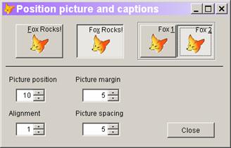
Figure 11. A whole group of properties collaborate to determine the positions of images and text on command buttons, option buttons, and checkboxes.
The form in Figure 11 is included as Pictures.SCX in the Developer Downloads for this chapter, available from www.hentzenwerke.com.
Using GDI+ to specify images
VFP 8 added support for GDI+, a powerful graphics library. VFP 9 increases the ways you can take advantage of GDI+ in your applications. (One big way is in reports; see Chapter 7, “Customizing the Report Designer at Run time.”)
Through VFP 8, the only way to specify the picture used in an Image control was by pointing at a graphics file. VFP 9 offers an alternative; the new PictureVal property lets you specify a string or object that represents an image.
Why would you want to do this? You might have pictures stored in a Memo or Blob field. Using the Picture property, you have to save the picture from the field into a file and refer to that file. With PictureVal, you can just refer to the field, saving the step of copying the file and cleaning up afterwards.
PictureVal accepts either a character string or an object reference. If you supply a character string, it should be the binary representation of an image. For example, you might use FileToStr() to convert a graphic file into a character string. You can also specify the name of a Memo or Blob field containing the binary representation of an image file. However, PictureVal does not support General fields; think of it as a way to avoid using General fields.
While you can use a memo or blob field to contain graphic files and display them using an Image and the PictureVal property, the field isn’t bound to the control. When you move the record pointer, the Image isn’t updated; you have to explicitly set the PictureVal property after each movement.
The Developer Downloads for this chapter, available from www.hentzenwerke.com, includes
BlobDemo.SCX, a form that
stores images in a blob field and displays them, letting you move
through the cursor.
If you supply an object reference, the object must conform to the IPicture interface; you can create such objects using the LoadPicture() function.
If you specify both Picture and PictureVal for an Image
control, the PictureVal property
is used.
Helping users
A key goal of any application that includes a user interface is to make it easy for users to enter the right data. Several VFP 9 features contribute to that goal. The most significant is support for auto-completion in textboxes. In addition, the InputMask and Format properties have some new values, and you have more control over movement of the cursor among controls.
Auto-complete text boxes
When a field is limited to a particular set of values, it’s not unusual to use a combobox or listbox so the user can’t enter anything else. But in some situations, while the user is likely to choose from among a small set of values most of the time, the actual list is unlimited, so a combo or list isn’t the right choice. In other situations, the user is limited to one list, but will almost always choose from just a few values in that list. Consider an application for a doctor’s office. Most patients are likely to come from a small geographic area, though occasionally a patient may come from much farther away. Choosing from a combo or list for fields like state, zip code, or area code in this situation is likely to be slower than just typing in the desired value. Defining a combo or list to specify the town would be difficult, but it’s likely that most patients come from a handful of towns.
These are the situations for which auto-completion was created. This technique tracks a user’s entries in a particular field. When the user returns to that field, she’s offered a list of her most recent or most frequent entries. She can choose from the list or type something new. Internet Explorer is among the applications that supports auto-completion.
Figure 12 shows a form with a number of auto-complete textboxes. When you enter an auto-complete textbox, the list of choices appears. You can choose one with either the keyboard or the mouse, or you can start typing. As you type, the list narrows down to those items that match the characters you entered. If you type a new entry, it’s added to the list. You can remove an item from the list by highlighting it and pressing the Delete key.
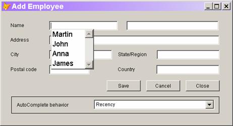
Figure 12. With auto-complete, a list of choices appears when you enter a textbox. Once you start typing, the list narrows down to those items that match what you entered so far.
Not surprisingly, auto-complete data is stored in a table. You can choose whether to put all auto-complete data in a single table, use separate tables for each application or even for each textbox that supports auto-complete within an application. By default, auto-complete data is stored in AutoComp.DBF in the directory specified by HOME(7) (the user application data directory). Table 7 shows the required structure for the auto-complete table; VFP creates the table automatically when it’s needed.
Table 7. The table that stores auto-complete data saves information that lets you organize the list in several different ways.
|
Field |
Type |
Purpose |
|
Source |
Character (20) |
Identifies the textboxes that include this item in their auto-complete lists. |
|
Data |
Character (254) |
The item to include in auto-complete lists. |
|
Count |
Integer |
The number of times this item has been chosen. |
|
Weight |
Integer |
A user-specified (or developer-specified) weight for this item to determine where it appears in the list. |
|
Created |
DateTime |
The timestamp when this item was added. |
|
Updated |
DateTime |
The timestamp when this item was last updated. |
|
User |
Memo |
Available for user-specified data. |
The auto-complete table supports several different ways of organizing the list of items. Those options are echoed in the AutoComplete property that turns this feature on. Table 8 shows the values for AutoComplete. Not surprisingly, when AutoComplete is set to 2, 3, or 4, the list is sorted in descending order, based on the specified field. For AutoComplete values of 2 and 4, the Updated field is used to break ties. You can change the AutoComplete property at run time, so you can offer users the chance to control the order of these items. (The form in Figure 12 does so, but in a production application, you’re more likely to put this choice in an Options dialog.)
Table 8. Enabling auto-complete—the AutoComplete property controls auto-complete behavior for an individual textbox.
|
Value |
Meaning |
|
0 |
No auto-complete for this textbox. |
|
1 |
Turn on auto-complete with the list in alphabetical order. |
|
2 |
Turn on auto-complete with the list ordered by frequency of use (the Count field). |
|
3 |
Turn on auto-complete with the list ordered by time of use (the Updated field). |
|
4 |
Turn on auto-complete with a user-specified ordering of the list (the Weight field). |
If every textbox in an application had its own list for auto-complete, the auto-complete table would grow far too large and, more importantly, users would become frustrated, as an item entered on one form fails to show up for the same field on another form.
Fortunately, VFP’s auto-complete feature is designed to avoid this problem. The new AutoCompSource property of textboxes lets you specify a category for the textbox, such as FirstName or City. All textboxes with the same value for AutoCompSource share a single list of items, based on the value of the Source field in the auto-complete table. (You have probably seen this behavior with websites where your name or email address appears in an Auto-complete list for a website you never used before.)
In practice, this means that for each application you build,
you probably want to subclass your textbox class for each category, setting
AutoCompSource appropriately. Then, use your subclasses to build forms with
textboxes that share auto-complete data. Alternatively, if you already have a
builder for textboxes, you could add AutoCompSource there. You could
also use the Toolbox’s Properties functionality to ensure AutoCompSource gets
set for
each textbox.
By default, there’s a single auto-complete table. (As noted above, it’s stored in the directory referenced by HOME(7).) However, you can choose to put the table wherever you want and even to use multiple tables. The AutoCompTable property of the _SCREEN object specifies the default location for the AutoComp table. Set it to specify something other than the default location. Be aware that data is saved to the auto-complete table as soon as the user leaves the control, whether or not the user actually saves the data to the underlying table.
The auto-complete table must be an actual table. It can’t be a cursor or view.
In addition, textboxes have a new AutoCompTable property that lets you specify where to find the table for that particular textbox. When the property is empty, the textbox uses the table specified by _SCREEN.AutoCompTable. When both are empty, the default table is used.
 The
Developer Downloads for this chapter, available from www.hentzenwerke.com,
include the form shown in Figure 12 as EmployeeAdd.SCX. It has Auto-complete
enabled for all the textboxes except for the address. There’s no code behind
the form for the auto-complete capabilities; a number of properties are set for
the various textboxes. The form also includes a combobox that lets you change
The
Developer Downloads for this chapter, available from www.hentzenwerke.com,
include the form shown in Figure 12 as EmployeeAdd.SCX. It has Auto-complete
enabled for all the textboxes except for the address. There’s no code behind
the form for the auto-complete capabilities; a number of properties are set for
the various textboxes. The form also includes a combobox that lets you change
the auto-complete setting for the textboxes, so the lists appear in a
different order.
New formatting options
The InputMask and Format properties let you limit or
modify user input to increase the
chance of it being right. VFP 9 offers two new values for InputMask and
enhances an old Format setting.
InputMask controls individual characters in an input string. It includes settings to force you to enter alphabetic characters (“A”), or to force characters to uppercase (“!”). But there’s never been a way to combine the two, to permit only alphabetic characters and force some of them to uppercase. (The Format setting “!” forces the whole string to uppercase.) Use “U” for any character in the InputMask that must be alphabetic and uppercase. For example, you might specify “UAAAAAAAAAAAAAA” for a name field. Use “W” for a character that must be alphabetic and lowercase.
The “Z” setting for Format displays the field as blank if it’s empty. (The “Z” presumably stands for “zero.”) VFP 9 enhances this setting, so that if the value is an empty date, the control is shown as completely empty, except when it has focus. That is, with Format=“Z” and Value={ / / }, a control shows the slashes only when it has focus; when another control has focus, the control is totally blank.
Controlling focus
The Valid event has its roots in ancient Xbase. It lets you determine whether the entry in a control is valid and thus, whether that control should be allowed to lose focus. The return value for Valid determines where focus lands next. Return .T. to continue normally; return .F. or 0 to keep focus on the control. Return a number other than 0 to move focus forward or backward in the tab order.
VFP 9 introduces a new option that’s far less arcane. You can return an object reference to move focus to that object. What’s most intriguing about this new option is that you can even return a reference to an object on another form.
For example, you might have code like this in the Valid of a textbox for specifying a company name:
IF EMPTY(This.Value)
RETURN CompanyForm.txtCompanyName
ENDIF
If the user leaves the
company name field blank, focus is placed on the company name field of a
company form. (Of course, the company form must be available; however, you can
actually issue DO FORM to run a form from the Valid, and then set focus to a
control on that form. If the specified control doesn’t exist, error 1734,
“Property <name> is not found” fires. If the container object doesn’t
exist, error 13, “Alias is not found” fires. If you’re navigating a multi-level
containership hierarchy and specify an object that doesn’t exist, error 1923,
“Object <name> is not found” fires.)
Managing tooltips
VFP 9 includes several new features related to tooltips, the little help items that appear when you hover the mouse over a control. Two new functions, SYS(3007) and SYS(3009), are discussed in Chapter 14, “Language Improvements.”
SYS(3008) controls whether tooltips appear for hyperlinks (the tip that says “CTRL + click to follow link” when the mouse pauses over a hyperlink); it returns the current setting as a character value. Use SYS(3008, 0) to disable them, SYS(3008, 1) to enable them, or SYS(3008) to simply determine the current setting without changing it. The setting of SYS(3008) doesn’t change the actual behavior of the hyperlink, just the tooltip.
_ToolTipTimeOut specifies how long a ToolTip displays when the mouse pointer pauses over a control. Setting this system variable to -1 (the default value) indicates the normal Windows timeout is used. Setting it to 0 means a ToolTip displays until the mouse is moved. Use a value greater than 0 as the number of milliseconds to display the ToolTip.
Better combos and
listboxes
Comboboxes and
listboxes are extremely versatile controls, useful in a wide variety of
situations. VFP 9 makes them even more so, adding support for collections as
RowSource, and providing more control over their behavior.
Basing a combo or list
on a collection
Collections are
widely used in object-oriented programming to gather and process related items.
Visual FoxPro supports both native collections (through the Collection
baseclass) and COM collections. In VFP 9, a collection, whether native or COM,
can be used as the RowSource for a combobox or listbox.
To specify a collection
as the RowSource, set RowSourceType to 10-Collection. For RowSource, specify
the name of an object reference to the collection. You can also specify which
properties of the objects in the collection display in the list. If you don’t
include one or more properties in the RowSource, the behavior of the list
depends on the underlying type of the collection’s elements. If they’re scalar
values (ordinary data), the value displays. For any item in the list that is an
object, the string “(Object)” displays.
Figure 13 shows a
form containing a listbox. The listbox displays the contents of
VFP’s Projects collection (which is a COM collection). RowSource for the
listbox is set
to “_VFP.Projects, Name”; specifying Name tells the list to show only the value
of the
Name property.
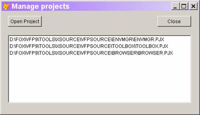
Figure 13. Lists and combos can now be based on the contents of a collection, including COM collections such as _VFP.Projects.
If you specify multiple properties for RowSource, they display in multiple columns. However, you must set ColumnCount appropriately.
The form shown in Figure 13 is included as CollectionList.SCX in the Developer Downloads for this chapter, available from www.Hentzenwerke.com.
Control the dropdown
portion of a combo
The DropDown
event of a combobox fires when the user clicks the down arrow to open the list.
In VFP 8 and earlier, there’s no way to prevent the dropdown portion from
opening. In VFP 9, issuing the NODEFAULT command in the DropDown method keeps the
list from opening up.
As with other methods,
you can use code in DropDown to determine whether to issue NODEFAULT. For
example, you might have a form-level property, lCanDrop, that determines
whether or not the dropdown can open. In that case, you use code like:
IF NOT ThisForm.lCanDrop
NODEFAULT
ENDIF
The Developer Downloads for
this chapter, available at www.hentzenwerke.com,
include ComboDrop.SCX, a form that demonstrates the ability to use NODEFAULT in
the DropDown method.
Controlling the scrollbar in listboxes
By default, a listbox always includes a vertical scrollbar. Most of the time, that’s a good choice, but sometimes you have a list that doesn’t need one some of the time. VFP 9 lets you decide whether such a list includes a scrollbar.
A new property, AutoHideScrollbar, lets you decide whether a listbox that doesn’t need a scrollbar has one. The default setting of 0 indicates the listbox should always have a scrollbar. When AutoHideScrollbar is set to 1, a scrollbar displays only when some items on the list are not shown. The listbox in Figure 13 has AutoHideScrollbar set to 1, so the scrollbar doesn’t appear until the list is filled.
Click fires more in
listboxes
The Click event
in a listbox is a little unusual. Not only does it fire when you actually click
an item in the list, but it also fires (along with a bunch of other events) as
you move through the list with the arrow keys. However, in VFP 8 and earlier,
other navigation keys don’t fire Click, even though they do fire the other
events.
VFP 9 adds some logic
to the situation by firing Click when the Home, End, PgUp, and PgDn fires are
used.
Mouse support
VFP 9 offers
several improvements related to the mouse, including one unrelated to forms and
probably more useful for developers than for end-users.
Memo and field tips
In Browse windows
and grids, memo fields show either “memo” (for empty fields) or “Memo” (if
there’s data). Until VFP 9, the only way to see the actual data in the memo
field was to open a memo window. VFP 9 offers memo tips, a quick way to see
memo
field contents.
Hover the mouse over a
memo field in a Browse window or grid and a tip (like a tooltip) appears,
showing the contents of the field. What makes this feature really cool is that
you
see the memo contents for the record the mouse is over, whether or not it’s the
selected record in the Browse or grid. Figure 14 shows a memo tip for the Notes field of the TasTrade
Employee table.
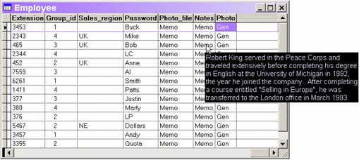
Figure 14. Memo tips make it easy to see what’s in a memo field.
For memo tips to work in grids, the form’s ShowTips property must be set to True. To see memo tips in the VFP IDE, _Screen.ShowTips must be True.
Having tips for memo fields would be good enough, but the VFP team went farther. Tips are available for all fields wider than their columns. That is, if you have a Browse window or grid where some columns are not wide enough to display the entire contents of the field, you can hold the mouse over the field to see the entire value.
Controlling the mouse
pointer in grids
The MousePointer
and MouseIcon properties control the appearance of the mouse pointer.
MousePointer lets you choose from among the familiar icons, such as the various
sizers, the I-beam, and so forth. You can also set MousePointer to 99 to
indicate that MouseIcon points to an icon file for a custom choice. In VFP 8
and earlier, the Column and Header objects don’t include the MousePointer and
MouseIcon properties; columns and headers use the same mouse pointer as the
grid itself.
VFP 9 adds these
properties to Column and Header, so each column and header in a grid can use a
different pointer (though that’s not likely to be a good choice from a user
interface perspective). The first place you’re likely to use these properties
is in a grid where clicking the header sorts on that column. You can use
MousePointer to indicate that effect.
As with many other
items in a grid, your settings for MousePointer and MouseIcon propagate
downward unless you specify otherwise. That is, if you leave MousePointer at
the default 0 for a column, it uses the grid’s setting. Similarly, if
MousePointer is 0 for a header, it uses the setting for that column.
Determine accurate
mouse position
The MROW() and
MCOL() functions return the row and column, respectively, of the current mouse
position. The return value is relative to the window where output is currently
being sent. Most of the time, that’s the active form. However, when a form’s
AllowOutput property (added in VFP 8) is True, the two are not the same. (In
code terms, WOUTPUT() <> _SCREEN.ActiveForm.) This is a problem when you
want to position something, like a shortcut menu, relative to the mouse.
VFP 9 solves this
problem with a new, optional parameter to MROW() and MCOL().
Pass 0 as the first parameter to specify that the mouse position should be
computed relative
to the active form, whether or not output is being sent there. For example, you
might have code like this:
nRow = MROW(0)
nCol = MCOL(0)
This.ShortcutMenu(nRow, nCol)
Grid improvements
In addition to
memo and field tips, described in the previous section, VFP 9 offers one major
improvement and one change in functionality related to grids. The improvement
means grids can be used in many situations where they were previously
unworkable.
Optimize filtered grid
performance
In earlier
versions of VFP, filtered grids do not use Rushmore to optimize their display.
As a result, a form with a grid on a large filtered table may be so slow to
appear that the user thinks the application has frozen.
VFP 9 finally gives you
the option to apply Rushmore in this situation. The new Optimize property tells
a grid whether or not to use Rushmore. The default, False, keeps the old, slow
behavior. Set Optimize to True to make filtered grids pay attention and appear
instantly.
Why would you ever
choose not to set Optimize to True? According to Help, there are some
situations where the process of optimizing could affect your results.
Optimization is performed not only when the grid is initially drawn, but when
it’s activated or its Refresh method fires. If the underlying data use row
buffering (probably not a good choice with a grid, anyway), the optimization
process may commit changes.
Our take is that we
will set Optimize to True in our base classes and don’t expect to ever turn it
off.
ControlSource reset
with RecordSource
Changing the
RecordSource of a running grid is a risky proposition. It throws away any
customization, such as changing the controls in the grid or sizing the columns.
According to Help, VFP 9 adds one more thing to that list. When the
RecordSource of a grid is changed, the ControlSource property of each column is
set to the empty string. This prevents errors that might occur if the new
RecordSource has different fields than the old one.
We see this behavior in
VFP 9. That said, in our tests, we also see it with VFP 8 SP1 and VFP 7 SP1.
Perhaps this is one of those situations where it didn’t work under certain
circumstances in earlier versions and now always works.
Odds and ends
This section
looks at a few more changes that affect forms and controls, but aren’t
easily categorized.
WordWrap for checkboxes
and option buttons
While the
captions for most checkboxes and option buttons are brief, now and then, you
need a longer caption. In VFP 8 and earlier, these controls don’t support word
wrap, so making
long captions look good is difficult. VFP 9 adds the WordWrap property to
CheckBox and OptionButton.
The control must be
large enough to show the caption. You can either manually size it or set
AutoSize to True. When WordWrap is True and you set AutoSize to True, the
control leaves the Width as is and expands vertically to make room for the
caption.
These two controls also have many additional choices for Alignment in VFP 9. When WordWrap is .T., the Alignment setting controls not only the position of the caption relative to the graphical portion of the control, but also the positioning of the wrapped text within the control. The form in Figure 15 includes three checkboxes, all with WordWrap set to True, but using three (of the nine) different values for Alignment.

Figure 15. For word-wrapped checkboxes and option buttons, Alignment determines whether text appears on the left or right of the control and how the text is aligned within the control.
The form in Figure 15 is included as Wrapped.SCX in the Developer Downloads for this chapter, available from www.hentzenwerke.com.
No deletion in grid used as listbox
VFP 8 added several properties that make it easier to use a grid like a listbox, as a control for a user to choose one record. VFP 9 plugs one flaw in that scenario.
When you set the AllowCellSelection property to False, cells in the grid don’t get focus. However, in VFP 8, a user can still click into the delete mark column and delete records from the grid. In VFP 9, when AllowCellSelection is False, clicks in that column are ignored.
Set index order in the data environment
VFP has always allowed you to specify the index order
to use for tables in the Data Environment via the Order property. VFP 9 adds
the ability to determine the direction
of the index.
When you specify an index programmatically, using the SET ORDER command or the ORDER clause of the USE command, you can specify ascending or descending order. The new OrderDirection property gives you the same ability for tables opened in the Data Environment. OrderDirection has three values, shown in Table 9.
Table 9. The OrderDirection property lets you specify whether an index is used in ascending or descending order.
|
Value |
Meaning |
|
0 |
Use the order in which the index tag was created. |
|
1 |
Use ascending order. |
|
2 |
Use descending order. |
You might be surprised to see three settings for this
property. Ascending and descending are straightforward, but the default setting
of 0 calls for explanation. VFP allows you to
create indexes in either ascending or descending order; to create an index in
descending
order, add the DESCENDING keyword to the INDEX command. Setting OrderDirection
to 0 indicates that the table should use the index in the direction it was
created, whether ascending or descending.
More control over added properties and methods
The AddProperty and WriteMethod methods let you add properties and methods, respectively, to an object. AddProperty is available at design-time and run time, while WriteMethod is design-time only. VFP 9 adds the ability to specify at design-time whether a new property or method is public, protected, or hidden, as well as letting you provide a description for the new member. Two additional parameters, nVisibility and cDescription, are used for the new information.
The new syntax for AddProperty is:
oObject.AddProperty( cName [, eValue [, nVisibility [, cDescription ] ] ] )
The new syntax for
WriteMethod is:
oObject.WriteMethod( cName, cCode [, lCreate [, nVisibility
[, cDescription ] ] ] )
The nVisibility
parameter has three possible values: 1-Public, 2-Protected, and 3-Hidden.
cDescription accepts a string to serve as the member’s description.
Not only can you use
AddProperty and WriteMethod to add members with specified visibility and
description, but you can also change the visibility or description of an
existing property or method by passing a different value for nVisibility or
cDescription. If you omit either parameter, an existing member keeps its
current value for that attribute.
The bottom line
VFP 9 continues the pattern of making it easier for developers to create attractive, functional user interfaces. Improvements range from major, such as dockable forms, to minor, such as specifying direction for an index, but each contributes to a better result.
Updates and corrections for this chapter can be found on Hentzenwerke’s website, www.hentzenwerke.com. Click “Catalog” and navigate to the page for this book.